Games and Graphics Level 3
Hello and welcome to the section of my website dedicated to my work done during the Games and Graphics Level 3 course at Preston College.
Here you can find all of the projects that I have done, along with details on how I got there.
Contents
What is the difference between Photoshop and Illustrator?
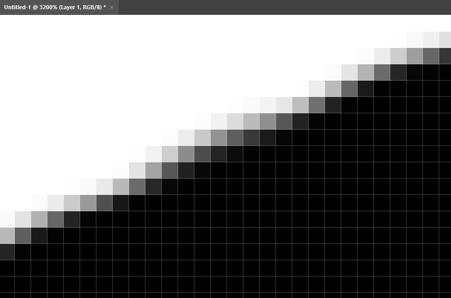
Adobe Photoshop
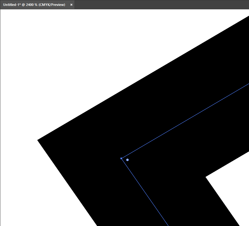
Adobe Illustrator
The main difference between the two is that Photoshop uses pixels and Illustrator uses anchor points. This can be visualised when zoomed in. Photoshop loses quality when zoomed, but Illustrator does not.
Illustrator Anchor Points
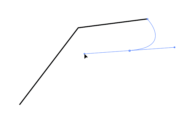
In Illustrator, you can create anchor points, these can be connected to each other. You can also control the curves of an anchor point by clicking and dragging.
McDonalds Logo Recreation
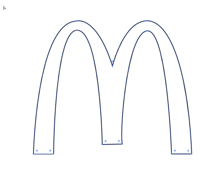
This is a recreation of the McDonalds logo in Illustrator, it is made up of anchor points, most of which have been curved.
My Character
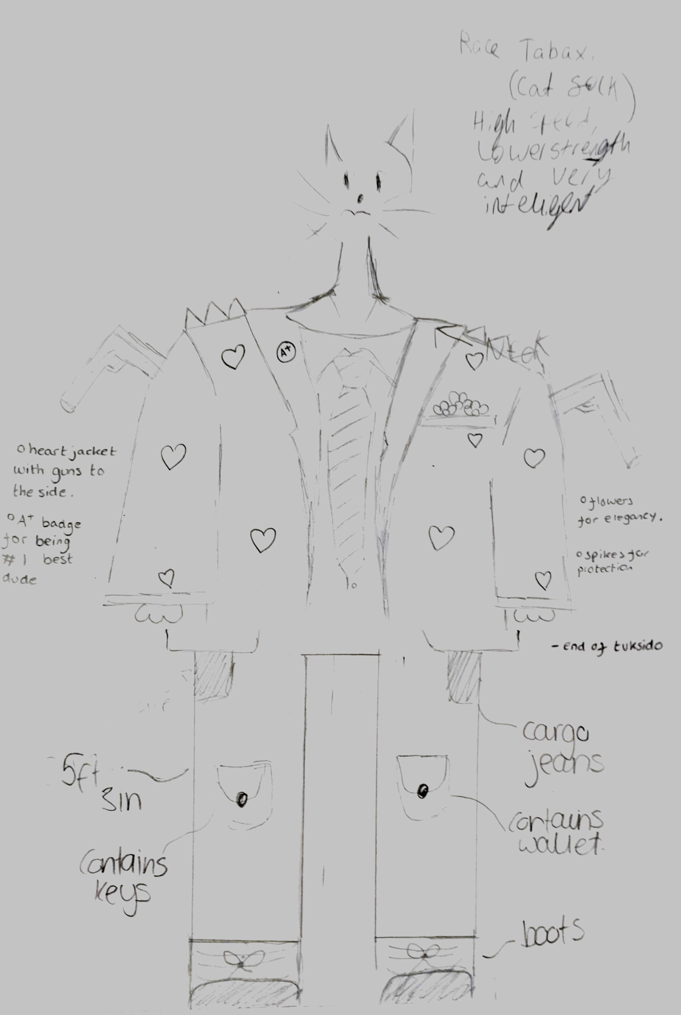
Original Image
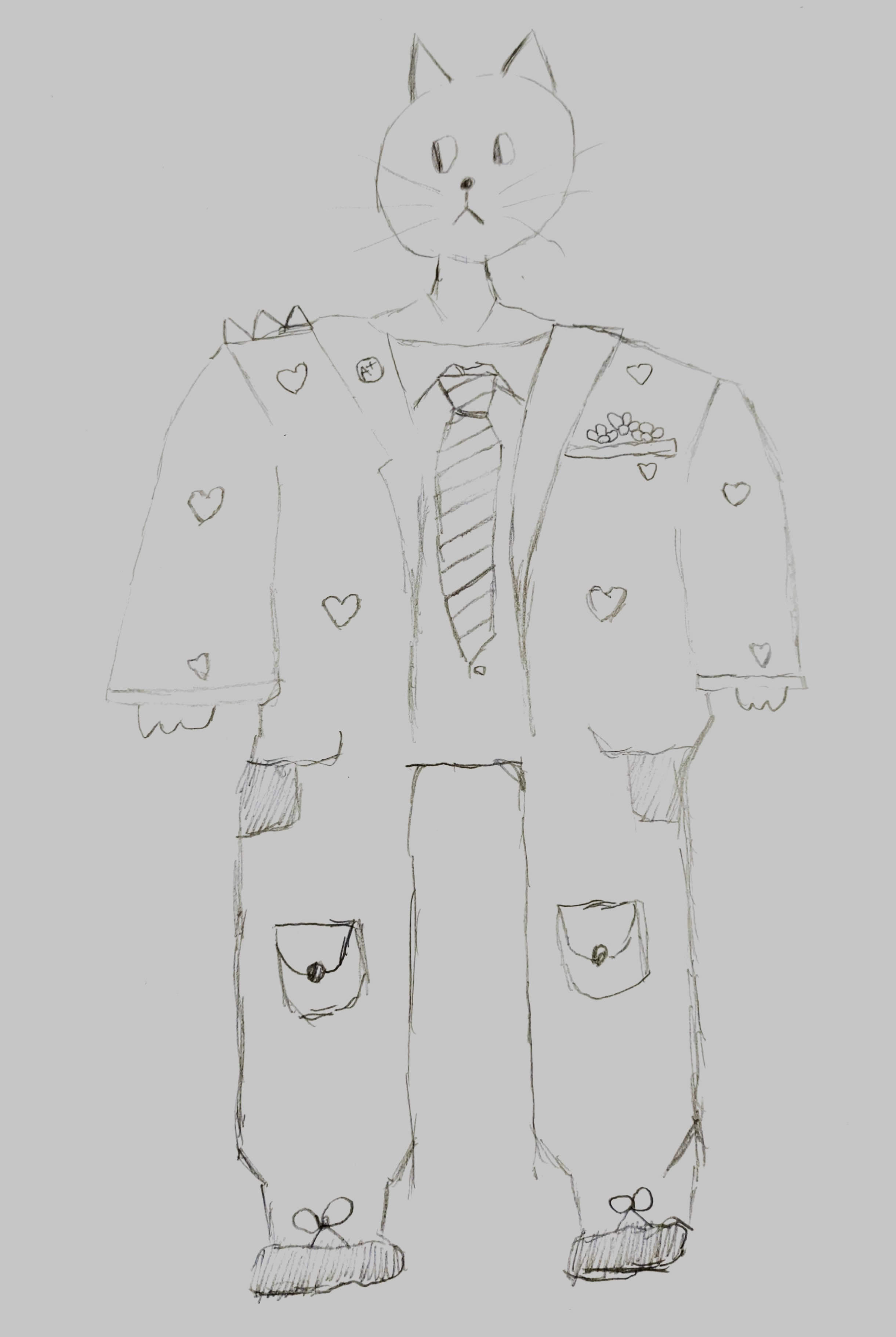
Refined Image
Design Reflection
This design was already very good to begin with and could be made even better with some small changes, such as fixing the proportions. The written content was also very good but could also be made more detailed.
About My Character
The race of this character is Tabaxi, more commonly known as cat folk, they are fast, have average strength and are very intelligent, this explains the cat head and paws that are visible to most. They are also 5 foot and 3 inches, making them about average for the race that they are.
They are commonly found wearing a shirt, tie and jacket with various badges attached, such as the “A+” badge. They also have flowers in their jacket pocket, these may have a secondary purpose, but they are assumed to just be there for the aesthetics.
They also wear cargo jeans and have plenty of pockets for storing important items such as keys and wallet. Boots are their usual footwear of choice as they are durable and comfortable for the long hours of work, they do.
They do some sort of work in the military, but it is unknown as to what they do. Probably something important if it is that secretive.
Refinement
The changes I made, was to remove the guns from the jacket, redraw the head to proper proportions so it looks better with the rest of the body and made the cargo jeans more rounded.
Character Research


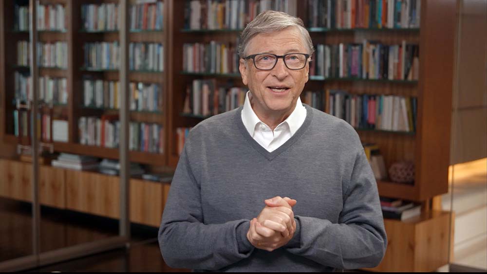


I have chosen to use Bill Gates as the character for my research here, he is a rather influential person and without him we wouldn't have software that we use daily, such as Microsoft Windows and Microsoft Office. Above are 5 images of Bill Gates.
Bill Gates is most well known for his work at Microsoft, on products such as Microsoft Windows and Microsoft Office, he has also built up a reputation for being charitable and advocating for various climate change mitigations to be put in place. He is also known for believing that AI will become a huge part of our lives in the future, and that the benefits outweigh the risks.
Magazine Research
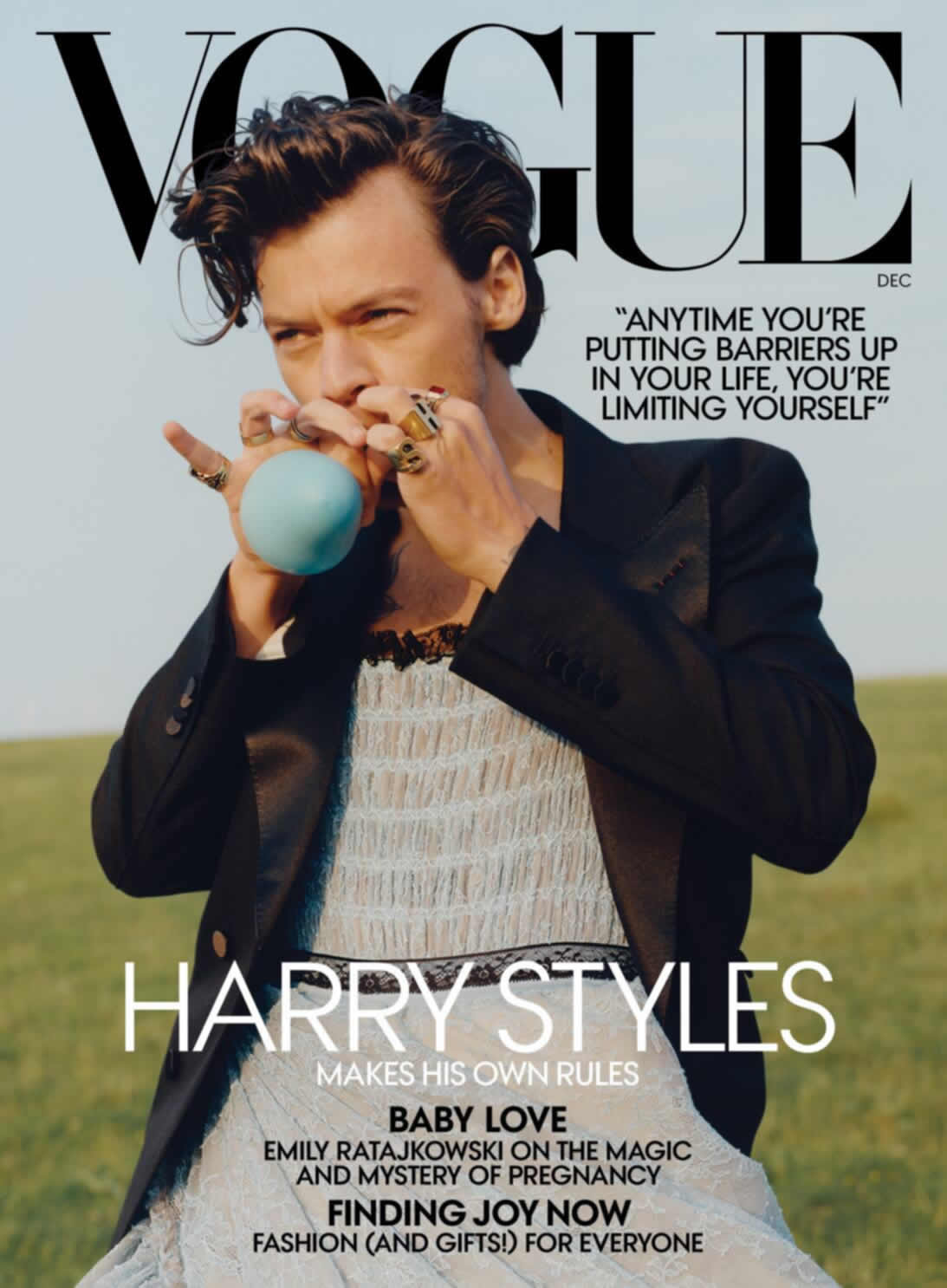
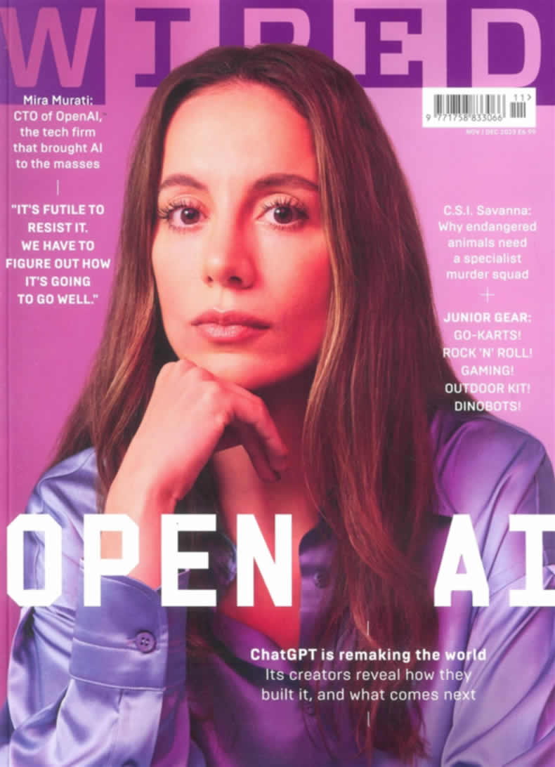
High end magazines generally only use one singular image of the person the magazine is about. They use very simplistic colours and are much less chaotic than other magazines such as the GAME magazine. They also don’t have any shapes on top of the image and have a very limited amount of text, and generally use fonts such as Times New Roman and Century Gothic, with no stroke. The GAME magazine does not stick to these conventions and uses many different fonts and colours, and just looks chaotic.
My chosen magazine is the WIRED magazine, it is also a fairly high end one which follows many of the same design principles such as having the subject front and centre and keeping text to the sides without putting them in solid coloured boxes like lower end magazines or tabloids would.
Tracking and Leading
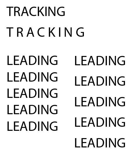
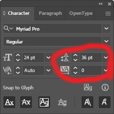
Tracking is the spacing between characters and leading is the vertical spacing. The tool above can change the tracking and leading, by changing the controls circled in red.
Thumbnail
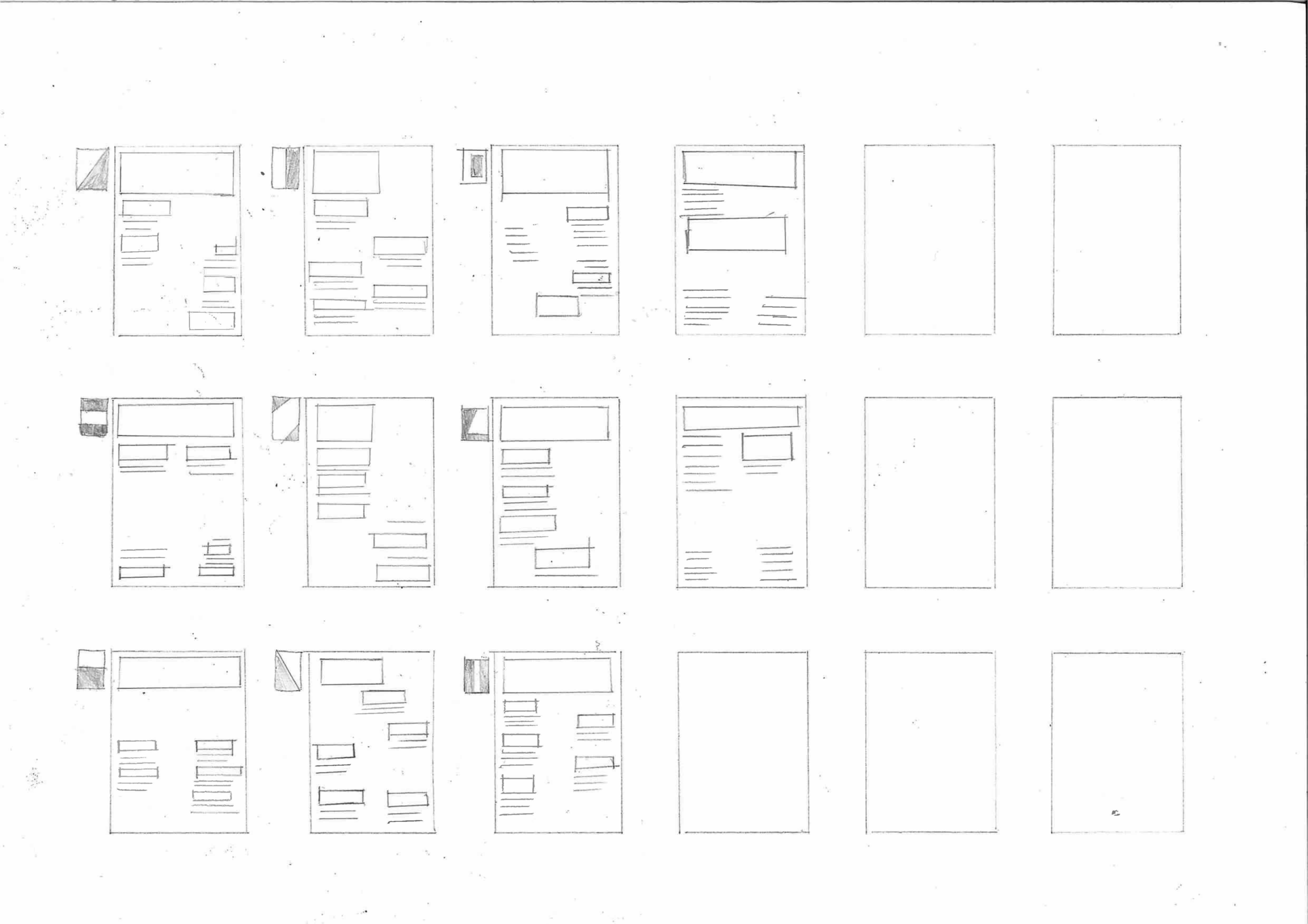
Here you can see that I have drawn multiple layouts for a magazine front cover, some have space for more text and headings than others.
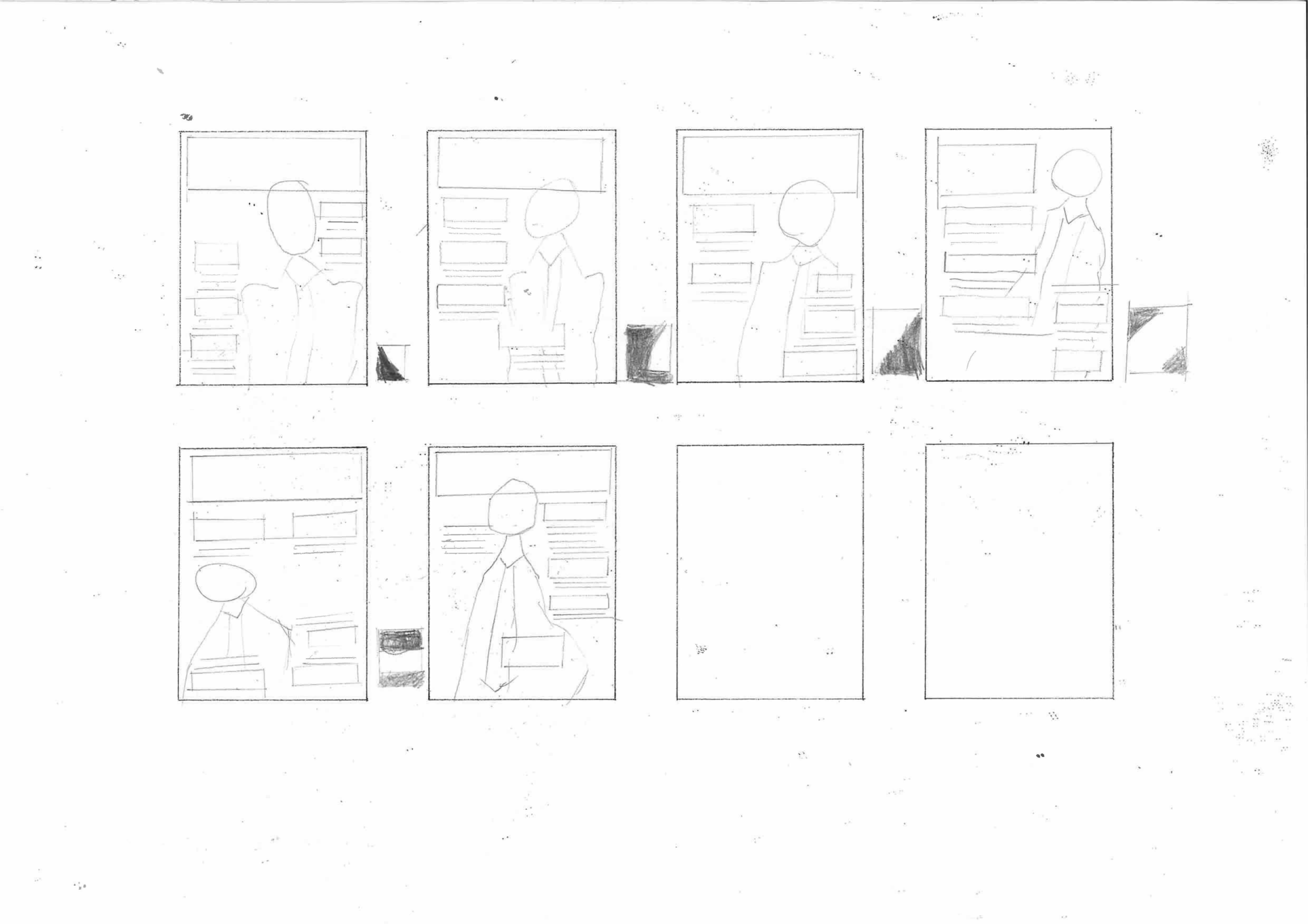
These are the scaled up and more detailed versions of the thumbnails above.
Final Illustration
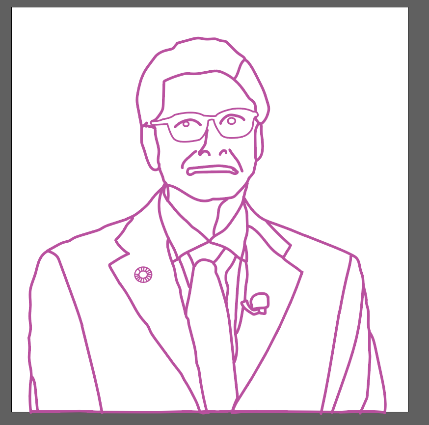
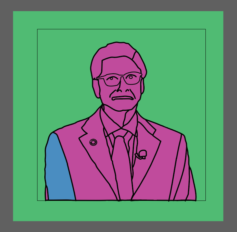
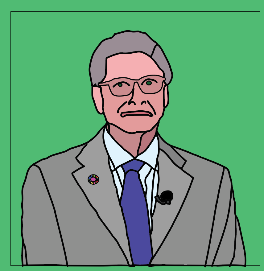
For this illustration I drew the lines based on a picture of Bill Gates, making sure that there are no gaps in the lines and then separated each section so I could fill it in with colour. The ugliest colour possible was chosen for the lines, because it is unlikely to ever be used in an actual illustration.
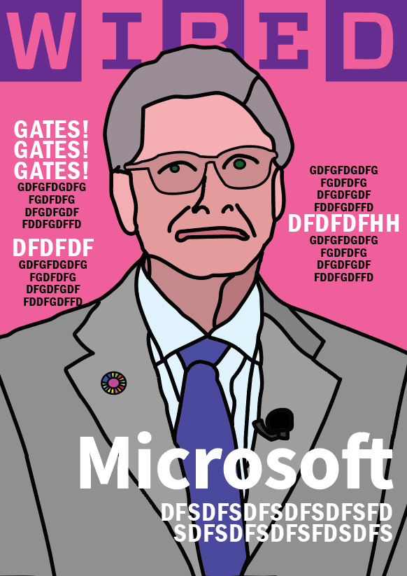
Here is the basic layout of the magazine cover put into illustrator, the text is just placeholder text.
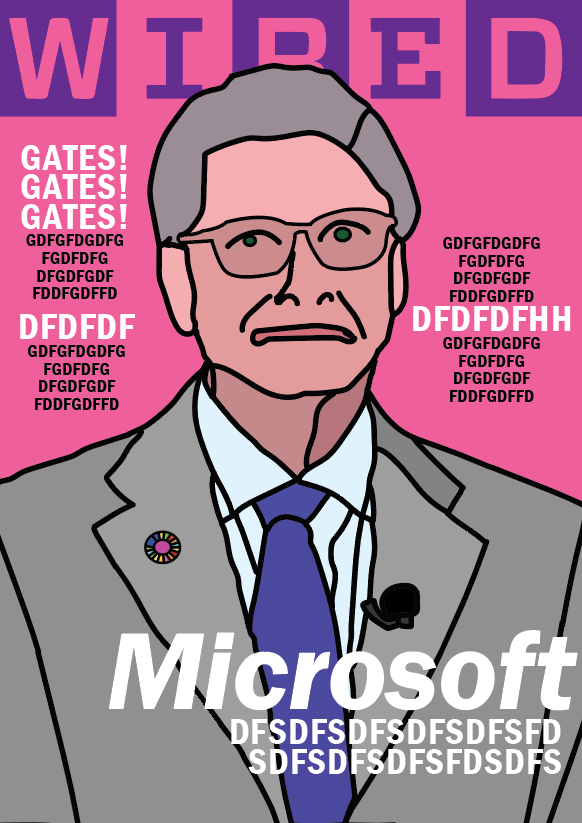
Here is the same thing, but with a more refined layout.
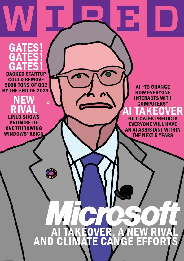
Here is the layout from before, but now with the final text in place. It is looking a lot more like an actual magazine cover now.

This is the finished magazine cover, with a layout and typeface similar to what would be found on a Vogue magazine. The main thing here that I am unsure about is the colours used, I took these straight from a WIRED magazine cover and never changed them. If I was to do this project again, I would make a better illustration, and have a better choice of colours.